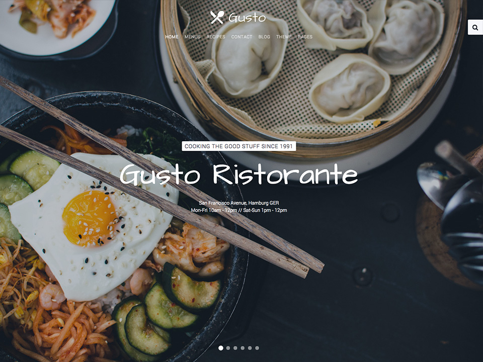
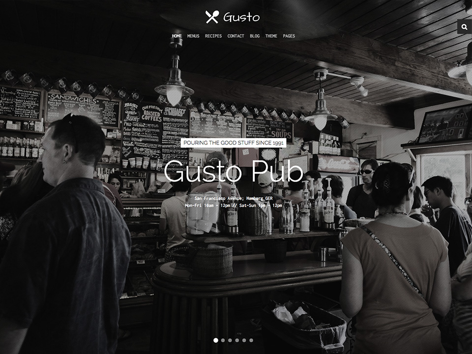
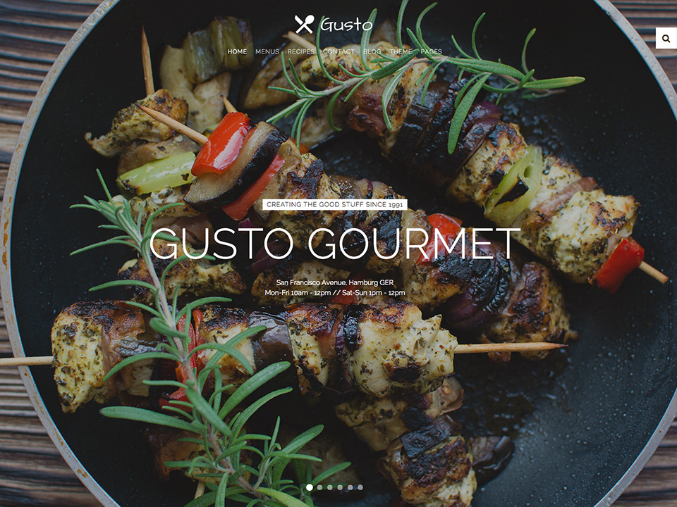
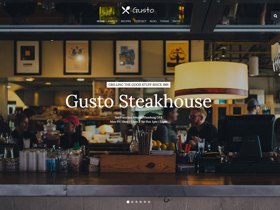
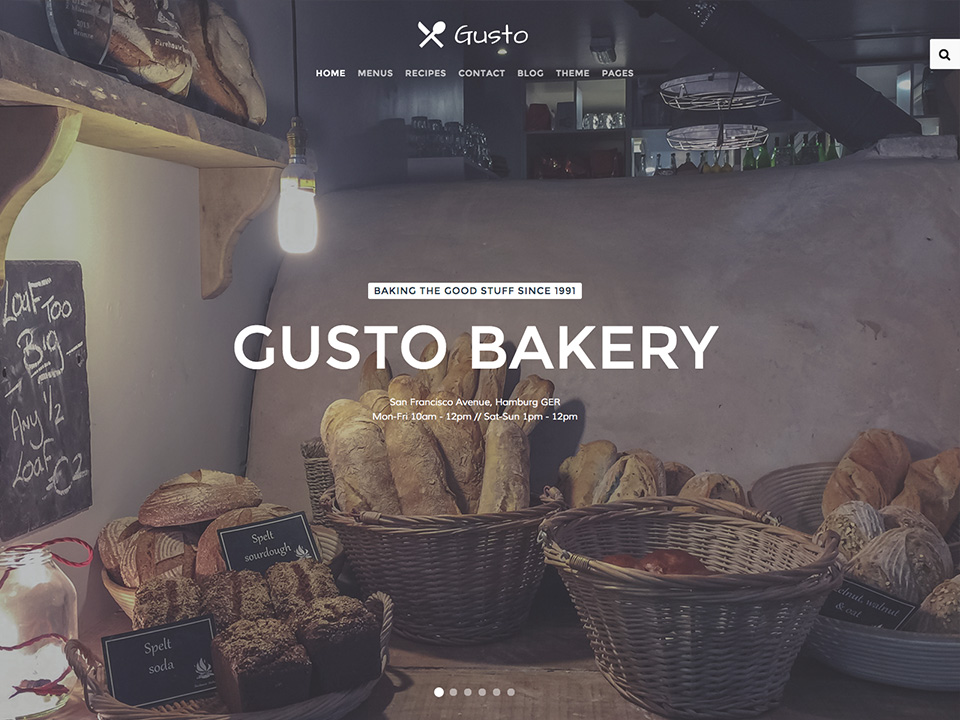
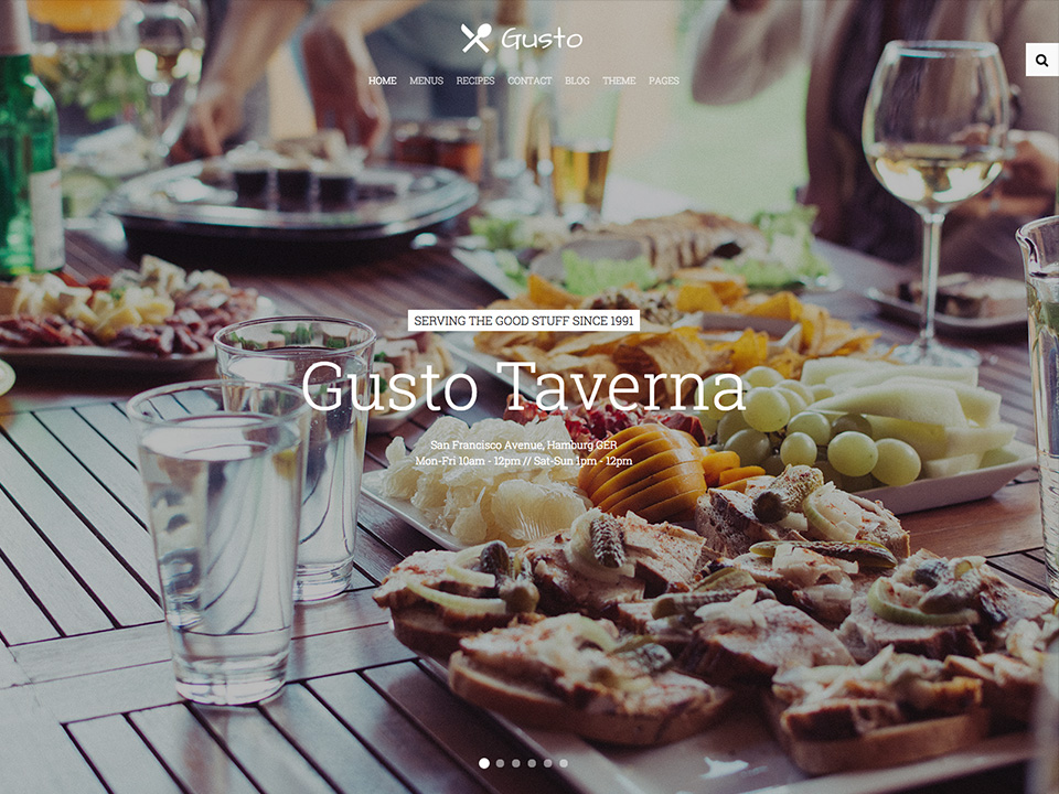
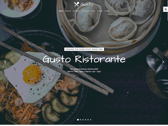
Theme Features

This theme is built on the Warp framework, a well-engineered theme framework for WordPress and Joomla, and utilizes all of its latest features. The user interface is powered by UIkit, a lightweight and modular front-end framework, which provides the theme's styling. The theme also comes with a wide range of different layouts and widget variations.

Theme Styles

Gusto provides six fancy styles to choose from.

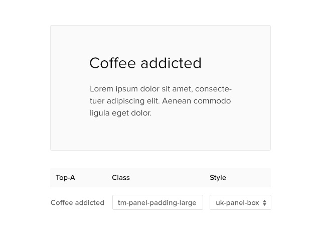
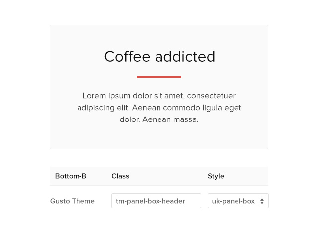
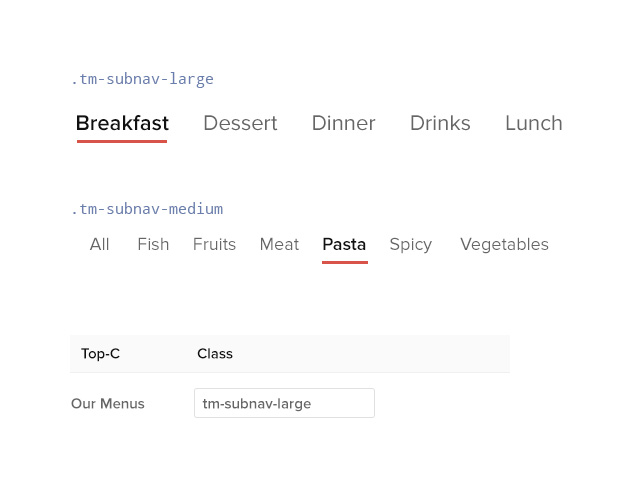
We provide lovingly crafted style variations to give you a glimpse of what is possible with this theme. The built-in theme customizer allows you to modify colors, fonts, sizes and much more without any CSS knowledge. Just choose your colors with the color picker and adjust the theme with only a few clicks. Click on one of the images to see the style.

Default

Default

Pub

Pub

Gourmet

Gourmet

Steakhouse

Steakhouse

Bakery

Bakery

Taverna

Taverna

Fehler

Kategorie nicht gefunden

New Demo Pages

Gusto comes with some exclusive demo pages, perfectly fitted for gastronomy related websites.

New
Menus

Menus

Provides content templates for menus and special offers.

View page

New
Recipes

Recipes

Provides content templates for recipes and specials.

View page

New
Contact

Contact

A contact page with a form template and map widget.

View page

Theme Additions

Theme additions and and UIkit modifiers.

Menus List

Menus List

To create menus, we've added a new list style. Add the .tm-list class to an unordered list.

<ul class="tm-list">
    <li><span class="tm-list-badge">0.5L</span> <h4>Mai Tai</h4> <span class="uk-badge">€ 6,50</span></li>
    <li><span class="tm-list-badge">0.5L</span> <h4>Caipirinha</h4> <span class="uk-badge">€ 12,80</span></li>
</ul>

Special Grid

Special Grid

To use this layout template, we've created a combination of UIkit based markup and four different Grid widgets from Widgetkit with a custom widget "Grid Gusto" which has modified markup and is included in this theme. To get this looking good, you need the right image sizes for your widget media.

Markup Example

<div class="tm-special-grid uk-grid uk-grid-collapse" data-uk-grid-match="{target:'> div > .uk-panel'}">
    <div class="uk-width-large-2-3">
        <div class="uk-panel tm-panel-light">
            [widgetkit id="72" name="Home Special Offerings Large 1"]
        </div>
    </div>
    <div class="uk-width-large-1-3">
        <div class="uk-panel tm-panel-dark">
            [widgetkit id="71" name="Home Special Offerings Small 1"]
        </div>
    </div>
</div>

<div class="tm-special-grid uk-grid uk-grid-collapse" data-uk-grid-match="{target:'> div > .uk-panel'}">
    <div class="uk-width-large-1-3">
        <div class="uk-panel tm-panel-dark">
            [widgetkit id="74" name="Home Special Offerings Small 2"]    
        </div>
    </div>
    <div class="uk-width-large-2-3">
        <div class="uk-panel tm-panel-light">
            [widgetkit id="75" name="Home Special Offerings Large 2"]
            
        </div>
    </div>
</div>

Icon Title

Icon Title

To upgrade your h1 headline elements, add the .tm-panel-icon class to your module/widget in the Warp UI, select H1 as the title style, enable center and pick an icon.


Article Columns

Article Columns

Add the .tm-article-columns class to every paragraph element to create a two column text block.

<p class="tm-article-columns">
Lorem ipsum dolor sit amet, consectetuer adipiscing elit. Aenean commodo ligula eget dolor. Aenean massa. Cum sociis natoque penatibus et magnis dis parturient montes, nascetur ridiculus mus. Donec quam felis, ultricies nec, pellentesque eu, pretium quis, sem. 
</p>

Panel Paddings

Panel Paddings

Add the .tm-panel-large-padding class to every module/widget to add larger inner spacing. You can also add the .tm-panel-medium-padding class for a slightly larger inner space.

Box Header

Box Header

Add the .tm-panel-box-header class to every module/widget with the panel box style to add a border to the panel title. Works with centered content, too.

Subnav Modifiers

Subnav Modifiers

Add the .tm-subnav-large or .tm-subnav-medium class to every .uk-subnav parent wrapper to get larger subnav items and an animated border for interactive actions.


Logo Sticky

Logo Sticky

If you would like to use the Transparent and Sticky setting for your website navigation, you will need to create two different logo versions to make it look pretty. The CSS will automatically switch the two logo images. Just add the .tm-logo-sticky class to your alternative logo as shown in this example.

<img src="images/logo.svg" alt="Demo">
<img class="tm-logo-sticky" src="images/logo_sticky.svg" alt="Sticky Logo">

Layout Profiles

Layout Profiles

As usually, we are using layout profiles to create different settings for different pages/menu items.

Gusto already has a handful of profiles for the demo pages, but you can easily add your own layout. Choose your settings and assign the profile a single or multiple menu items. Please remember that you can not overrride another profile, in this case un-assign the other profile first!


Post Options

Post Options

We have also added a feature to grant you more flexibility when working with post images in WordPress.

You can now decide whether your image will be positioned to the left, right or top of your posts. This option applies to single blog post views, as well. In our demo, images are aligned left in the posts view while the single view displays them at the top.

UIkit Framework

UIkit Framework

A lightweight and modular front-end framework for developing fast and powerful web interfaces.

Read more

Warp Framework

Warp Framework

A fast and slick theme framework which is built on the latest web techniques.

Read more

This theme is available for JoomlaJoomla and WordpressWordPress including the same features on each system.

Inspiration

Öffnungszeiten

Montag bis Freitag: 13 Uhr bis 19 Uhr
fon +49 (0)621-7901188 oder
fon +49 (0)6232-657770
fax +49 (0)621-7901182

was uns wichtig ist

Wir benutzen Cookies

Wir nutzen Cookies auf unserer Website. Einige von ihnen sind essenziell für den Betrieb der Seite, während andere uns helfen, diese Website und die Nutzererfahrung zu verbessern (Tracking Cookies). Sie können selbst entscheiden, ob Sie die Cookies zulassen möchten. Bitte beachten Sie, dass bei einer Ablehnung womöglich nicht mehr alle Funktionalitäten der Seite zur Verfügung stehen.